Element
In a hierarchy with a screen component ancestor, the element component is used to build user interfaces composed of 2D components such as images and text. Elements provide layout properties such as anchors and pivot points.
For more details, see the User Interface section.
Group Element
Group elements only provide the layout properties of the element component.
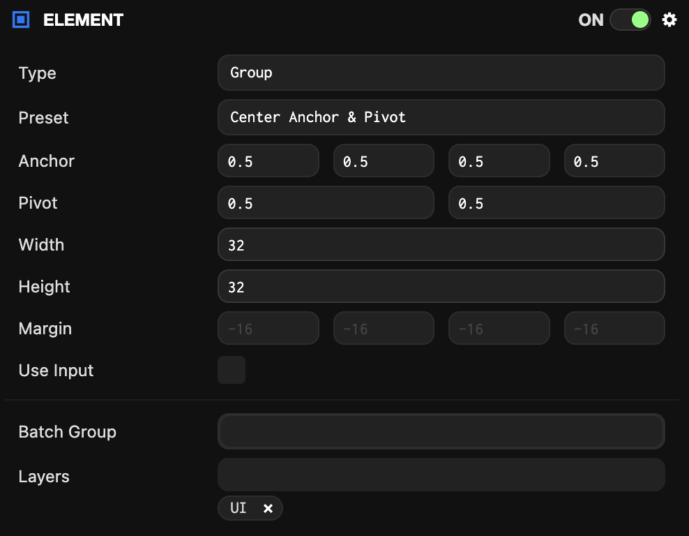
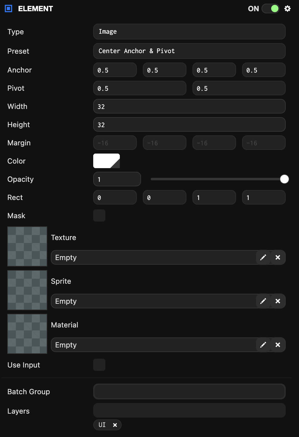
Image Element
Image elements display images using texture assets or solid colors.
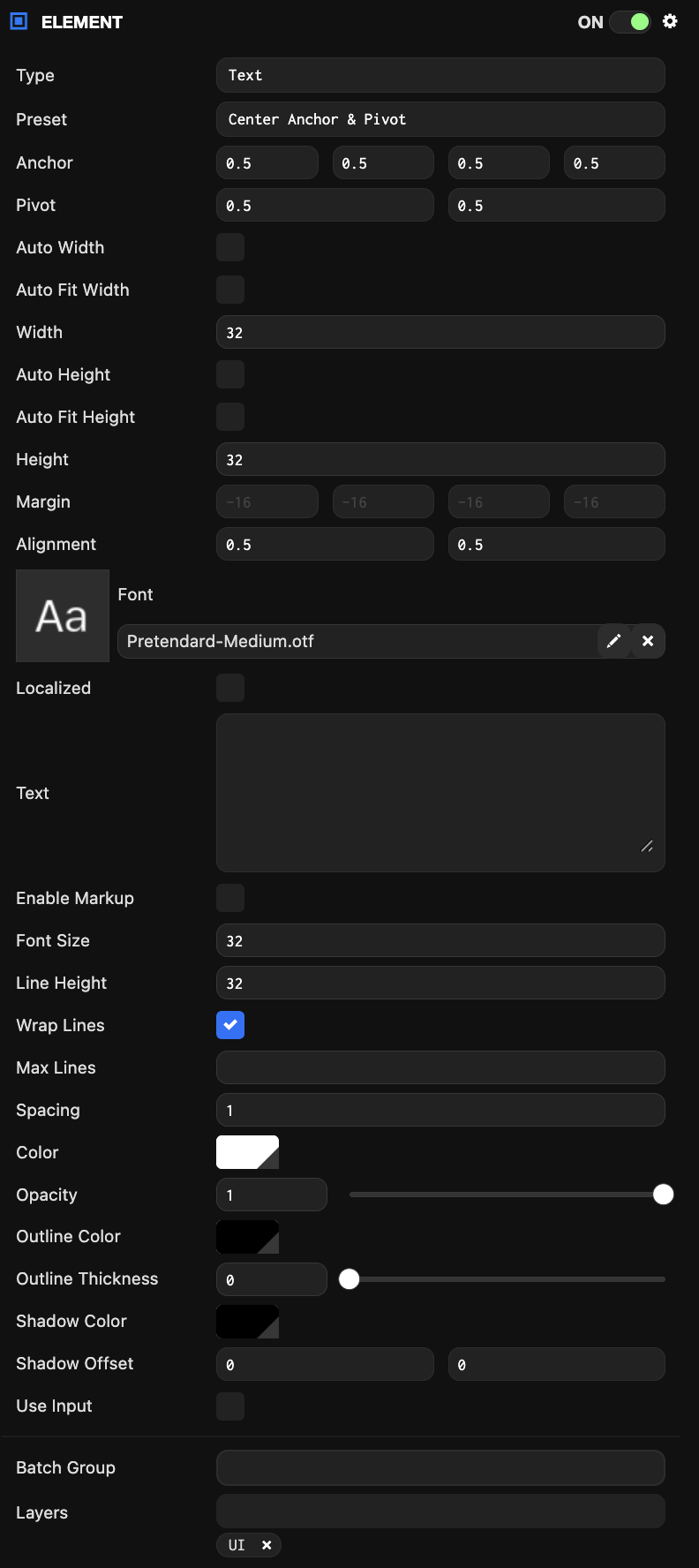
Text Element
Text elements render text strings using font assets.
Common Component Properties
| Property | Description |
|---|---|
| Type | The type of element: Group, Image, or Text. |
| Preset | When a layout preset is selected, the Anchor and Pivot properties are automatically set to the preset values. |
| Anchor | Determines the reference point for calculating the element's position. See the Elements#Anchor section for more details. |
| Pivot | Determines where the element's pivot point is located. (0, 0) is bottom-left, (1, 1) is top-right. See the Elements#Pivot section for more details. |
| Size | The width and height of the element. Can be automatically calculated based on other settings. |
| Margin | The distance from the element's edge to the Anchor. Only available when the Anchor is split (not the same on one axis). |
| Use Input | When enabled, this element is added to the list of elements that check for input and fire input-related events. |
| Layers | The layers on which this element will be rendered. See here for more details about layers. |
| Batch Group | The batch group this model belongs to. |
Image Component Properties
| Property | Description |
|---|---|
| Rect | Defines the area of the texture asset to display. |
| Mask | Converts the image element to a mask. Masks are not rendered to the scene, but instead limit child elements to only render where this element would be rendered. |
| Texture | The texture asset to display. |
| Color | The color to tint the element. |
| Opacity | The transparency of the element. |
Text Component Properties
| Property | Description |
|---|---|
| Alignment | Determines how text is aligned within the element. (0, 0) is bottom-left, (1, 1) is top-right. |
| Text | The text string to display. |
| Font Size | The size in screen component pixels to render the font. |
| Line Height | The size in screen component pixels for moving to a new line. |
| Spacing | A multiplier applied to the advance between each character. |
| Font | The font asset. |
| Color | The color to tint the font. |
| Opacity | The transparency of the element. |
| Wrap Lines | Enables text wrapping. All text that exceeds the width of the text element will wrap to the next line. |