Button
The button component is a convenient shortcut for creating user interface buttons to be used with screen and element components.
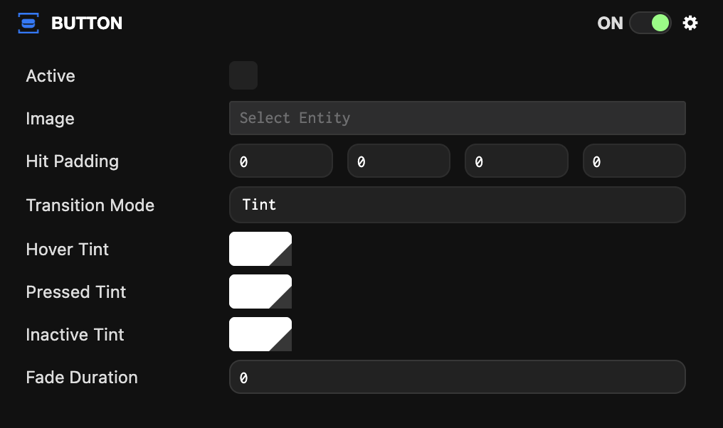
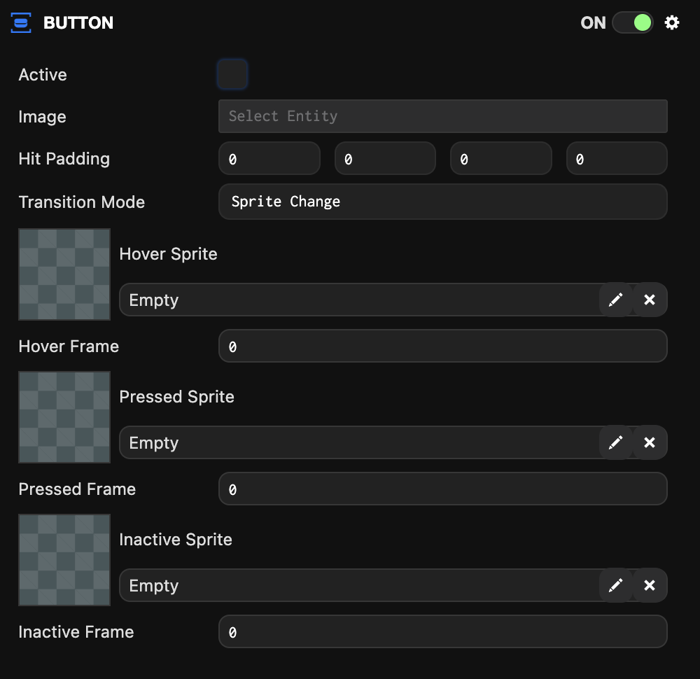
The button component can be used in two transition modes. Tint which tints a single sprite with different colors for each state, or Sprite Change which uses different sprites or frames for each button state.
Common Properties
| Property | Description |
|---|---|
| Active | When enabled, the button responds to and fires events. When disabled, the button is set to inactive state. |
| Image | The image element entity used to detect input events. |
| Hit Padding | Additional space around the image element to be included when testing input events. |
| Transition Mode | The type of effect to use for transitions between states. Either Sprite Change or Tint. |
Tint Properties
| Property | Description |
|---|---|
| Hover Tint | The color to tint the image element when the button is in hover state. |
| Pressed Tint | The color to tint the image element when the button is in pressed state. |
| Inactive Tint | The color to tint the image element when the button is in inactive state. |
| Fade Duration | The time in milliseconds to blend between different state colors. |
Sprite Change Properties
| Property | Description |
|---|---|
| Hover Sprite | The sprite asset used when the button is in hover state. |
| Hover Frame | The sprite frame to display when the button is in hover state. |
| Pressed Sprite | The sprite asset used when the button is in pressed state. |
| Pressed Frame | The sprite frame to display when the button is in pressed state. |
| Inactive Sprite | The sprite asset used when the button is not active. |
| Inactive Frame | The sprite frame used when the button is not active. |
Scripting Interface
You can control the button component's properties using a script component. The button component's scripting interface is here.