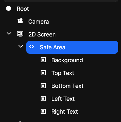
Safe Area
As mobile devices trend toward full-screen displays, notches or cutouts are used on displays to make room for earpiece speakers and front-facing cameras (see iPhone X below).
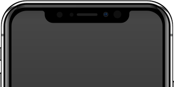
(Image source: Rafael Fernandez, modified version: OasisW, CC BY-SA 4.0, via Wikimedia Commons)
Developers need to be careful about essential information that users need, which can be hidden by the notch during development.
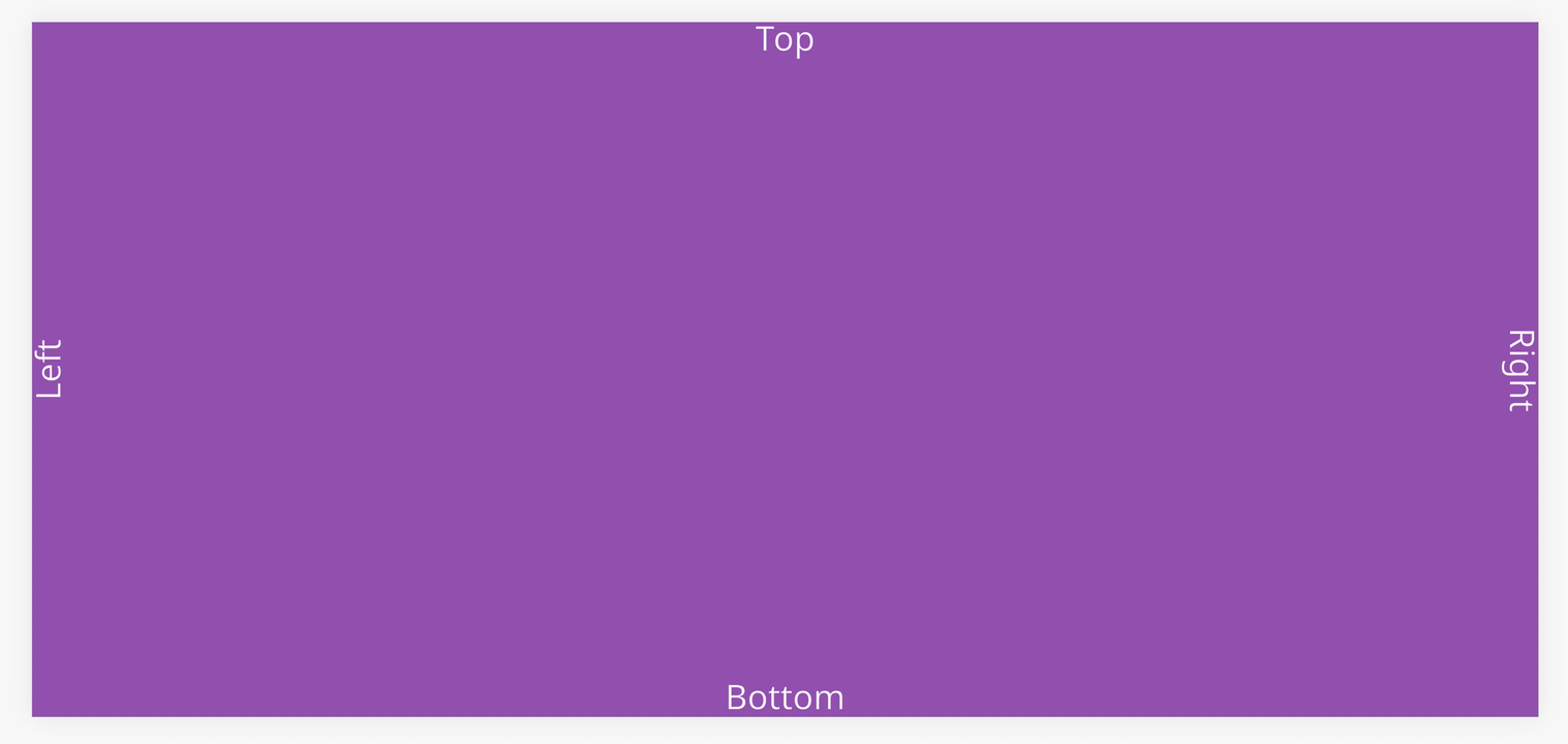
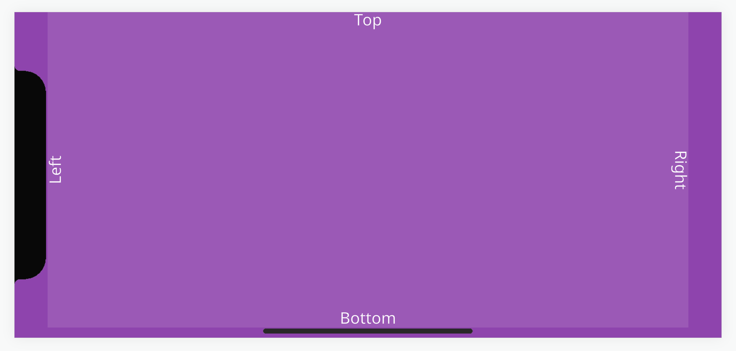
For example, the screenshot below looks fine in the desktop developer tools mobile view.
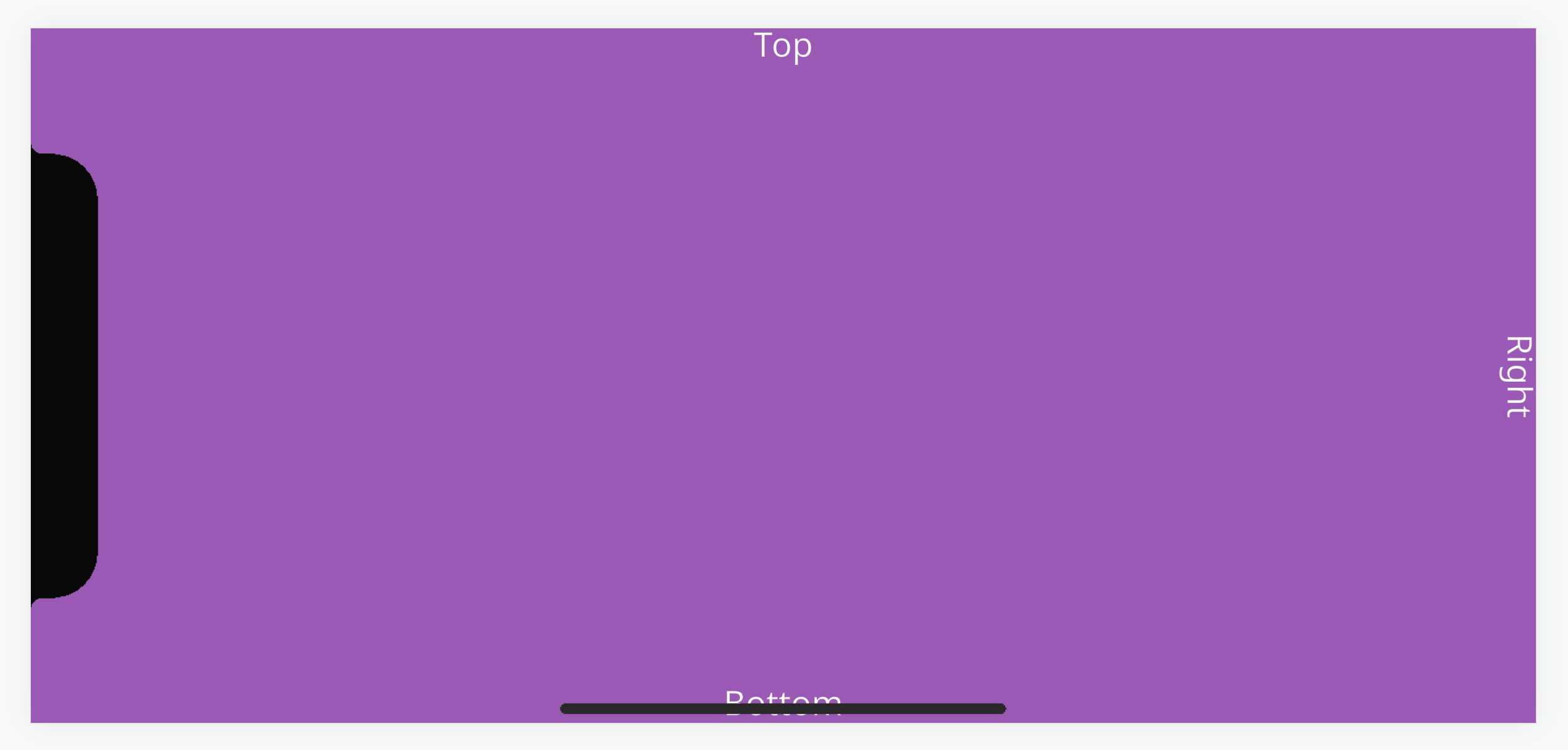
But when opened on a mobile device like the iPhone X, the 'Left' text is rendered under the notch and the 'Bottom' text is rendered under the navigation bar.
Safe Area
To help developers, browsers on these devices support CSS environment variables that return values for placing elements within the area occupied by the notch or navigation bar. This is called the 'safe area'.
We have a project with a reusable script that takes these CSS values and applies them to a UI group element entity through margin size adjustments.
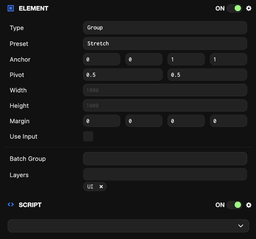
The project's UI setup has an entity with a full-screen group element called 'Safe Area'. This has a 'mobileSafeArea' script attached that contains logic to fit elements within the device's safe area.
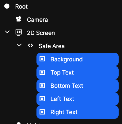
All essential UI elements can be placed as children of the safe area entity so they are anchored relative to the safe area entity.
To help with development, you can enable debug settings that simulate the safe area so you can preview how the UI layout will look without a device.
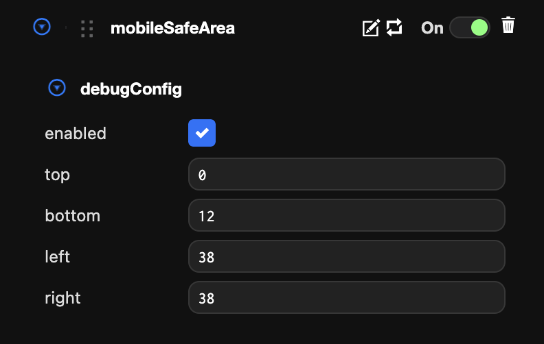
Debug settings can also be edited with real-time updates in the launch tab.